Visočica
- website development
- website design
- logo redesign
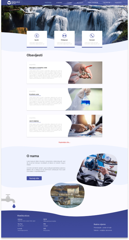
Visočica is a trusted water supply firm dedicated to providing essential services to communities. We are committed to ensuring access to clean and reliable water, empowering individuals and fostering sustainable development.
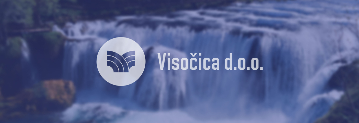
Logo
Visočica's logo has undergone a rebranding process to ensure its suitability for the digital world. The new logo retains its essence while being simplified and optimised for versatile digital applications.
![]()
Inspired by the graceful flow of water, the logo incorporates wavy lines and curves, reflecting the fluidity and dynamic nature of our services. This refreshed design captures commitment to adaptability and dedication to shaping the future of water supply. The logo for Visočica, water supply firm, embodies the majestic spirit of the mountainous terrain it serves.
Typography
In the Visočica website project, we have carefully selected the Raleway font. With its modern and versatile design, Raleway exudes clarity and professionalism. This font choice aligns with our commitment to delivering clear and concise information, ensuring a pleasant and engaging reading experience for website visitors.

Raleway
Solano Gothic Pro MVB
Color Palette
In website design, we have embraced a captivating shade of blue as the primary colour. This hue represents the purity and serenity of water, embodying mission to deliver reliable water supply services. Through various tones of blue, we create a visually harmonious environment that evokes feelings of trust, calmness, and a deep connection to nature.