OPG Nikola Stević
- website development
- website design
- logo redesign
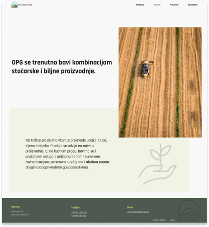
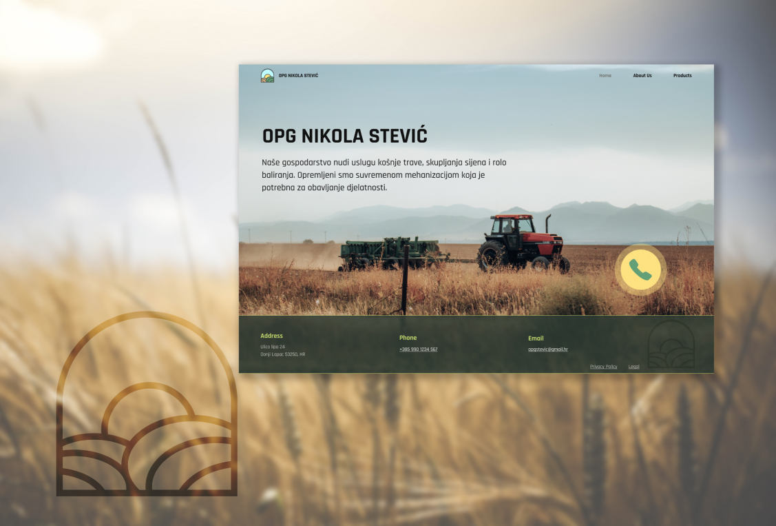
OPG Stević is a family business deeply rooted in the combined world of livestock and plant production. With utmost dedication, they bring a range of exceptional products and services tailored to meet customer agricultural needs.
Logo
Inspired by the rolling hills and lush greenery, the logo encapsulates the essence of family business. It symbolises the beauty of the mountainous landscape, reflecting deep connection to the natural surroundings. The logo serves as a proud emblem of OPG Stević, reflecting values and commitment to excellence
![]()
Typography
For the OPG Stević website project, we have carefully selected the Rajdhani font. This modern and versatile typeface captures the essence of brand, conveying professionalism and trustworthiness. With its clean lines and distinct legibility, Rajdhani adds a touch of elegance to website, ensuring a delightful reading experience.
 Rajdhani
Color Palette
The colour palette we have chosen for the OPG Stević web project reflects the vibrancy of the agricultural landscape. Neon and olive green hues dominate, representing the energy and vitality of nature. Touches of neon green represents growth, innovation, and the constant pursuit of improvement, while olive green evokes a sense of stability, balance, and connection to the earth. These colours evoke a sense of growth, freshness, and a strong connection to nature, enhancing the visual appeal of website. This colour combination creates an engaging visual environment, immersing customer in the essence of OPG Stević.